Рисование фигур Draw shapes
Узнайте, как рисовать фигуры — эллипсы, прямоугольники, многоугольники и пути. Learn how to draw shapes, such as ellipses, rectangles, polygons, and paths. При помощи класса Path в пользовательском интерфейсе XAML можно применять довольно сложный язык для рисования на основе векторов, например рисовать кривые Безье. The Path class is the way to visualize a fairly complex vector-based drawing language in a XAML UI; for example, you can draw Bezier curves.
Область пространства в пользовательском интерфейсе XAML определяется двумя наборами классов: Shape и Geometry. Two sets of classes define a region of space in XAML UI: Shape classes and Geometry classes. Главное различие между этими классами заключается в том, что у класса Shape имеется связанная с ним кисть, и он может быть отрисован на экране, а класс Geometry просто определяет область и не отрисовывается на экране, если не содержит сведений для другого свойства пользовательского интерфейса. The main difference between these classes is that a Shape has a brush associated with it and can be rendered to the screen, and a Geometry simply defines a region of space and is not rendered unless it helps contribute information to another UI property. Объект Shape можно представить как элемент UIElement, граница которого определена объектом Geometry. You can think of a Shape as a UIElement with its boundary defined by a Geometry. В этом разделе содержатся в основном сведения о классах Shape. This topic covers mainly the Shape classes.
Классы Shape: Line, Ellipse, Rectangle, Polygon, Polyline и Path. The Shape classes are Line, Ellipse, Rectangle, Polygon, Polyline, and Path. Класс Path интересен тем, что с его помощью можно описать произвольное геометрическое тело, а класс Geometry используется для того, чтобы определить части класса Path. Path is interesting because it can define an arbitrary geometry, and the Geometry class is involved here because that’s one way to define the parts of a Path.
Функции Fill (заливка) и Stroke (росчерк) для фигур Fill and Stroke for shapes
Чтобы объект Shape можно было отрисовать на холсте приложения, необходимо сопоставить с ним класс Brush. For a Shape to render to the app canvas, you must associate a Brush with it. Установите для свойства Fill объекта Shape нужное значение Brush. Set the Fill property of the Shape to the Brush you want. Подробнее о кистях см. в статье Использование кистей. For more info about brushes, see Using brushes.
Кроме того, объект Shape также может иметь свойство Stroke, представляющее собой линию, нарисованную по периметру фигуры. A Shape can also have a Stroke, which is a line that is drawn around the shape’s perimeter. Для свойства Stroke также необходим класс Brush, определяющий его внешний вид, а свойству StrokeThickness необходимо присвоить ненулевое значение. A Stroke also requires a Brush that defines its appearance, and should have a non-zero value for StrokeThickness. StrokeThickness — это свойство, которое определяет толщину периметра, ограничивающего фигуру. StrokeThickness is a property that defines the perimeter’s thickness around the shape edge. Если значение Brush для свойства Stroke не задано или задано нулевое значение StrokeThickness, граница вокруг фигуры не будет нарисована. If you don’t specify a Brush value for Stroke, or if you set StrokeThickness to 0, then the border around the shape is not drawn.
Эллипс Ellipse
Ellipse (эллипс) — это фигура с закругленным периметром. An Ellipse is a shape with a curved perimeter. Чтобы создать обычную фигуру Ellipse, укажите значения Width, Height и Brush для Fill. To create a basic Ellipse, specify a Width, Height, and a Brush for the Fill.
Ниже показан отрисованный объект Ellipse. Here’s the rendered Ellipse.
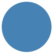
В данном случае большинство людей сочтут фигуру Ellipse кругом, но именно так определяется круг в языке XAML: используется фигура Ellipse, где значения Width и Height равны. In this case the Ellipse is what most people would consider a circle, but that’s how you declare a circle shape in XAML: use an Ellipse with equal Width and Height.
Когда фигура Ellipse размещается в макете интерфейса, ее размер принимается равным размеру прямоугольника со сторонами Width и Height. Область за пределами периметра не отрисовывается, но все равно считается частью пространства макета. When an Ellipse is positioned in a UI layout, its size is assumed to be the same as a rectangle with that Width and Height; the area outside the perimeter does not have rendering but still is part of its layout slot size.
Набор из 6 элементов Ellipse входит в состав шаблона элемента управления ProgressRing, а 2 концентрических элемента Ellipse являются частью RadioButton. A set of 6 Ellipse elements are part of the control template for the ProgressRing control, and 2 concentric Ellipse elements are part of a RadioButton.
Rectangle Rectangle
Rectangle (прямоугольник) — это фигура с четырьмя сторонами, противоположные стороны которой равны. A Rectangle is a four-sided shape with its opposite sides being equal. Чтобы создать обычную фигуру Rectangle, укажите значения Width, Height и Fill. To create a basic Rectangle, specify a Width, a Height, and a Fill.
Углы Rectangle можно скруглить. You can round the corners of a Rectangle. Чтобы создать скругленные углы, задайте значения для свойств RadiusX и RadiusY. To create rounded corners, specify a value for the RadiusX and RadiusY properties. Эти свойства указывают оси x и y эллипса, определяющего скругление углов. These properties specify the x-axis and y-axis of an ellipse that defines the curve of the corners. Максимально допустимое значение свойства RadiusX — это значение Width, разделенное на два, а максимально возможное значение RadiusY — это значение Height, разделенное на два. The maximum allowed value of RadiusX is the Width divided by two and the maximum allowed value of RadiusY is the Height divided by two.
В следующем примере создается фигура Rectangle, у которой значение Width равно 200, а Height — 100. The next example creates a Rectangle with a Width of 200 and a Height of 100. Она использует значение Blue свойства SolidColorBrush для своего свойства Fill и значение Black свойства SolidColorBrush для своего свойства Stroke. It uses a Blue value of SolidColorBrush for its Fill and a Black value of SolidColorBrush for its Stroke. Мы задаем для свойства StrokeThickness значение 3. We set the StrokeThickness to 3. Задаем для свойства RadiusX значение 50, а для свойства RadiusY — значение 10, что определяет для фигуры Rectangle скругленные углы. We set the RadiusX property to 50 and the RadiusY property to 10, which gives the Rectangle rounded corners.

Совет. В некоторых сценариях определения элементов интерфейса вместо объекта Rectangle удобнее использовать объект Border. Tip There are some scenarios for UI definitions where instead of using a Rectangle, a Border might be more appropriate. Если вы хотите создать прямоугольную фигуру вокруг некоторого содержимого, удобнее использовать объект Border, так как он может иметь дочернее содержимое и его размеры автоматически настраиваются по размеру содержимого, благодаря чему отпадает необходимость задавать конкретные ширину и высоту прямоугольника, как в случае с Rectangle. If your intention is to create a rectangle shape around other content, it might be better to use Border because it can have child content and will automatically size around that content, rather than using the fixed dimensions for height and width like Rectangle does. Объект Border можно также создавать с закругленными углами, задав значение свойства CornerRadius. A Border also has the option of having rounded corners if you set the CornerRadius property.
С другой стороны, объект Прямоугольник , вероятно, представляет собой лучший вариант для компоновки элементов управления. On the other hand, a Rectangle is probably a better choice for control composition. Фигура Rectangle отображается во множестве шаблонов элементов управления, так как она используется как часть «FocusVisual» для фокусируемых элементов управления. A Rectangle shape is seen in many control templates because it’s used as a «FocusVisual» part for focusable controls. Каждый раз, когда элемент управления находится в визуальном состоянии с фокусом ввода, этот прямоугольник становится видимым, в других состояниях он скрыт. Whenever the control is in a «Focused» visual state, this rectangle is made visible, in other states it’s hidden.
Многоугольник Polygon
Polygon — это фигура, имеющая границу, определяемую произвольным числом точек. A Polygon is a shape with a boundary defined by an arbitrary number of points. Граница создается путем проведения линии от одной точки к другой и соединения последней точки с первой. The boundary is created by connecting a line from one point to the next, with the last point connected to the first point. Свойство Points определяет коллекцию точек, образующих границу. The Points property defines the collection of points that make up the boundary. В языке XAML точки определяются с помощью списка с разделителями-запятыми. In XAML, you define the points with a comma-separated list. В коде программной части мы используем для определения точек объект PointCollection, где каждая точка добавляется в коллекцию как значение Point. In code-behind you use a PointCollection to define the points and you add each individual point as a Point value to the collection.
Вам не нужно в явном виде объявлять начальную и конечную точки, так как обе они определяются одним значением Point. You don’t need to explicitly declare the points such that the start point and end point are both specified as the same Point value. В логике отрисовки Многоугольник предполагается, что задана замкнутая фигура, в которой начальная точка объединяется с конечной точкой. The rendering logic for a Polygon assumes that you are defining a closed shape and will connect the end point to the start point implicitly.
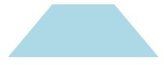
В следующем примере создается фигура Многоугольник по 4 точкам, заданным координатами (10,200) , (60,140) , (130,140) и (180,200) . The next example creates a Polygon with 4 points set to (10,200) , (60,140) , (130,140) , and (180,200) . Здесь используется значение LightBlue для параметра SolidColorBrush в свойстве Fill и не задано значение Stroke, поэтому фигура рисуется без контура по периметру. It uses a LightBlue value of SolidColorBrush for its Fill, and has no value for Stroke so it has no perimeter outline.
Ниже показан отрисованный объект Polygon. Here’s the rendered Polygon.
Совет. Значение Point часто используется в качестве типа в XAML для сценариев, в которых не объявляются вершины фигур. Tip A Point value is often used as a type in XAML for scenarios other than declaring the vertices of shapes. Например, Point входит в состав данных событий сенсорного ввода, что позволяет точно определить, где в системе координат произошло действие касания. For example, a Point is part of the event data for touch events, so you can know exactly where in a coordinate space the touch action occurred. Подробнее о параметре Point и его использовании в XAML или коде см. в справочных статьях по API для Point. For more info about Point and how to use it in XAML or code, see the API reference topic for Point.
Линия Line
Line (линия) — это линия, проведенная между двумя точками в координатном пространстве. A Line is simply a line drawn between two points in coordinate space. Объект Line игнорирует значение параметра Fill, так как не имеет внутреннего пространства. A Line ignores any value provided for Fill, because it has no interior space. Для объекта Line нужно задать значения свойств Stroke и StrokeThickness, так как в противном случае объект Line не будет отрисован. For a Line, make sure to specify values for the Stroke and StrokeThickness properties, because otherwise the Line won’t render.
Не следует использовать значения Point для определения фигуры Line. Вместо этого задайте отдельные значения Double для параметров X1, Y1, X2 и Y2. You don’t use Point values to specify a Line shape, instead you use discrete Double values for X1, Y1, X2 and Y2. Это позволяет сократить разметку для горизонтальных и вертикальных линий. This enables minimal markup for horizontal or vertical lines. Например, код
Polyline Polyline
Фигура Polyline похожа на фигуру Polygon тем, что ее граница также определяется набором точек, но последняя точка в Polyline не соединяется с первой. A Polyline is similar to a Polygon in that the boundary of the shape is defined by a set of points, except the last point in a Polyline is not connected to the first point.
Примечание. Вы можете задать в явном виде одну и ту же точку в качестве начальной и конечной точки в наборе Points для получения фигуры Polyline, но лучше для этого использовать объект Polygon. Note You could explicitly have an identical start point and end point in the Points set for the Polyline, but in that case you probably could have used a Polygon instead.
Если вы задаете параметр Fill для фигуры Polyline, свойство Fill закрасит внутреннее пространство фигуры даже в том случае, если начальная и конечная точки в наборе Points для фигуры Polyline не совпадают. If you specify a Fill of a Polyline, the Fill paints the interior space of the shape, even if the start point and end point of the Points set for the Polyline do not intersect. Если вы не зададите параметр Fill, фигура Polyline будет напоминать комбинацию из нескольких отдельных элементов Line, у которых начальные и конечные точки соседних отрезков линии совпадают. If you do not specify a Fill, then the Polyline is similar to what would have rendered if you had specified several individual Line elements where the start points and end points of consecutive lines intersected.
Как и в случае фигуры Polygon, свойство Points определяет коллекцию точек, образующих границу. As with a Polygon, the Points property defines the collection of points that make up the boundary. В языке XAML точки определяются с помощью списка с разделителями-запятыми. In XAML, you define the points with a comma-separated list. В коде программной части мы используем PointCollection для определения точек, а затем добавляем каждую отдельную точку в коллекцию как структуру Point. In code-behind, you use a PointCollection to define the points and you add each individual point as a Point structure to the collection.
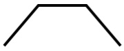
В этом примере создается фигура Polyline по четырем точкам, заданным координатами (10,200) , (60,140) , (130,140) и (180,200) . This example creates a Polyline with four points set to (10,200) , (60,140) , (130,140) , and (180,200) . Свойство Stroke определено, а Fill — нет. A Stroke is defined but not a Fill.
Ниже показан отрисованный объект Polyline. Обратите внимание, что первая и последняя точки не соединены контуром Stroke, как это сделано в фигуре Polygon. Notice that the first and last points are not connected by the Stroke outline as they are in a Polygon.
Путь Path
Фигура Path (путь) является наиболее универсальной из всех фигур Shape. С ее помощью можно создать произвольную геометрию. A Path is the most versatile Shape because you can use it to define an arbitrary geometry. Но эта универсальность порождает сложность. But with this versatility comes complexity. Давайте посмотрим, как создать простую фигуру Path на языке XAML. Let’s now look at how to create a basic Path in XAML.
Геометрия пути определяется с помощью свойства Data. You define the geometry of a path with the Data property. Есть два способа определения Data. There are two techniques for setting Data:
- Для свойства Data можно задать строковое значение на языке XAML. You can set a string value for Data in XAML. В этой форме значение Path.Data использует формат сериализации для графики. In this form, the Path.Data value is consuming a serialization format for graphics. Это значение обычно не редактируется как текст после того, как будет первый раз определено. You typically don’t text-edit this value in string form after it is first established. Вместо этого используются средства конструирования, позволяющие работать в режиме конструирования или рисования на поверхности. Instead, you use design tools that enable you to work in a design or drawing metaphor on a surface. Затем следует сохранить или экспортировать полученные данные, в результате чего будет создан файл или фрагмент строки XAML с информацией о Path.Data. Then you save or export the output, and this gives you a XAML file or XAML string fragment with Path.Data information.
- Можно назначить свойство Data отдельному объекту Geometry. You can set the Data property to a single Geometry object. Это можно сделать с помощью кода или XAML. This can be done in code or in XAML. Этот отдельный объект Geometry является, как правило, объектом GeometryGroup, который выполняет роль контейнера, объединяющего множество геометрических определений в один объект для целей объектной модели. That single Geometry is typically a GeometryGroup, which acts as a container that can composite multiple geometry definitions into a single object for purposes of the object model. Самая распространенная причина таких действий заключается в том, что нужно использовать одну или несколько кривых и сложных фигур, которые можно определить как значения Segments для объекта PathFigure, например BezierSegment. The most common reason for doing this is because you want to use one or more of the curves and complex shapes that can be defined as Segments values for a PathFigure, for example BezierSegment.
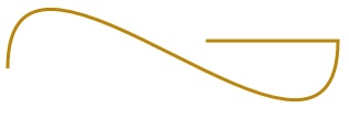
В этом примере показан объект Path, который можно получить с помощью Blend для Visual Studio путем создания нескольких векторных фигур с последующим сохранением результата в XAML. This example shows a Path that might have resulted from using Blend for Visual Studio to produce just a few vector shapes and then saving the result as XAML. Общий объект Path содержит сегмент кривой Безье и сегмент прямой. The total Path consists of a Bezier curve segment and a line segment. Этот пример служит иллюстрацией того, какие элементы существуют в формате сериализации Path.Data и что представляют числа. The example is mainly intended to give you some examples of what elements exist in the Path.Data serialization format and what the numbers represent.
Это свойство Data начинается с команды перемещения, отмеченной буквой M, которая определяет абсолютную начальную точку пути. This Data begins with the move command, indicated by «M», which establishes an absolute start point for the path.
Первый сегмент — кривая Безье третьего порядка, которая начинается в точке (100,200) и заканчивается в точке (400,175) . Чтобы начертить ее, используются две контрольные точки (100,25) и (400,350) . The first segment is a cubic Bezier curve that begins at (100,200) and ends at (400,175) , which is drawn by using the two control points (100,25) and (400,350) . Этот сегмент отмечен командой C в строке атрибута Data. This segment is indicated by the «C» command in the Data attribute string.
Второй сегмент начинается с команды абсолютно горизонтальной линии H, которая определяет линию, нарисованную от конечной точки предыдущего отрезка пути (400,175) до новой конечной точки (280,175) . The second segment begins with an absolute horizontal line command «H», which specifies a line drawn from the preceding subpath endpoint (400,175) to a new endpoint (280,175) . Так как это команда горизонтальной линии, указанным значением является координата по оси Х. Because it’s a horizontal line command, the value specified is an x-coordinate.
Далее показана отрисованная фигура Путь. Here’s the rendered Path.
В следующем примере показано применение другой вышеупомянутой технологии: GeometryGroup с PathGeometry. The next example shows a usage of the other technique we discussed: a GeometryGroup with a PathGeometry. В этом примере применяются некоторые геометрические типы в составе PathGeometry: PathFigure и различные элементы, которые могут быть сегментом в PathFigure.Segments. This example exercises some of the contributing geometry types that can be used as part of a PathGeometry: PathFigure and the various elements that can be a segment in PathFigure.Segments.
Далее показана отрисованная фигура Путь. Here’s the rendered Path.